London Tube Map with Walklines now in London Transport Museum
18 Nov 2015
“The walk-lines are superb! Classics are rarely improved by tinkering, but the walk-lines are a genuine improvement to the Underground map. Bravo!” - Edward Tufte
 Rodcorp Walklines map
In Nov 2015, the London Transport Museum opened its new permanent gallery London by Design, and they’ve included my Walklines map. It’s an honour to be in the same display case as the tube map’s creator Harry Beck.
Of course, a dozen years later there are real-time mobile services like Citymapper, but I still dream of maps that could switch between tube/walking, symbolic/geographic modes, while remaining on paper, foldable, pocket-stuffable…
 London Transport Museum display
Here’s my post from 2003, corrected for expired links though not for new stations and tube lines!:
London Tube Map with Walklines: sometimes it’s quicker to walk
For some journeys it’s really not worth getting on the tube: it takes a long time, and costs you money. Sometimes it’s quicker and easier to walk.
For instance: Leicester Square is only 250m from Covent Garden; Charing Cross to Embankment is about 300m; Chancery Lane to Farringdon by tube requires two changes and 4 stations. Mansion House to Bank: change once, 6 stops - as noted by Bill Bryson in Notes From a Small Island (though you could walk to Bank District Line, aka Monument, and go in two stops, but his point is still well made). Possibly, even Finchley Road to Hampstead (change twice, 9 stops) could be walked in half an hour, although the standard tube map won’t tell you that it’s up a steep hill.
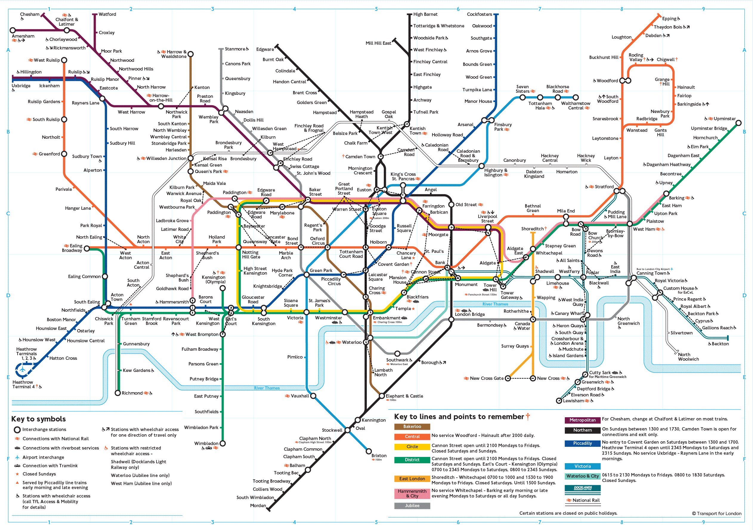
One of the very few weaknesses of the standard tube map is that its distortion of geography (a very successful attempt to present the different stations and lines more clearly) sometimes means that it’s not clear when the tube trip is unnecessary. This has been discussed on Edward Tufte’s site and in many other places, and there are many geographically corrected versions of the map.
But here’s a slightly altered map showing which stations are an arbitrary and as-the-crow-flies 500 metres apart from each other (there are many more stations 600, 700+ metres from each other). It doesn’t look great yet, and definitely reduces the readability of the standard tube map at the moment, which isn’t a good thing. So it’s not an improvement on the map, but it’s an interesting exercise.
- tube map with 500m walklines dotted in. The dense knots are Euston-Warren Street-Gt Portland St in Bloomsbury and Bank-Cannon St-Mansion House-St Paul’s in the city. And these are interesting places to walk anyway.
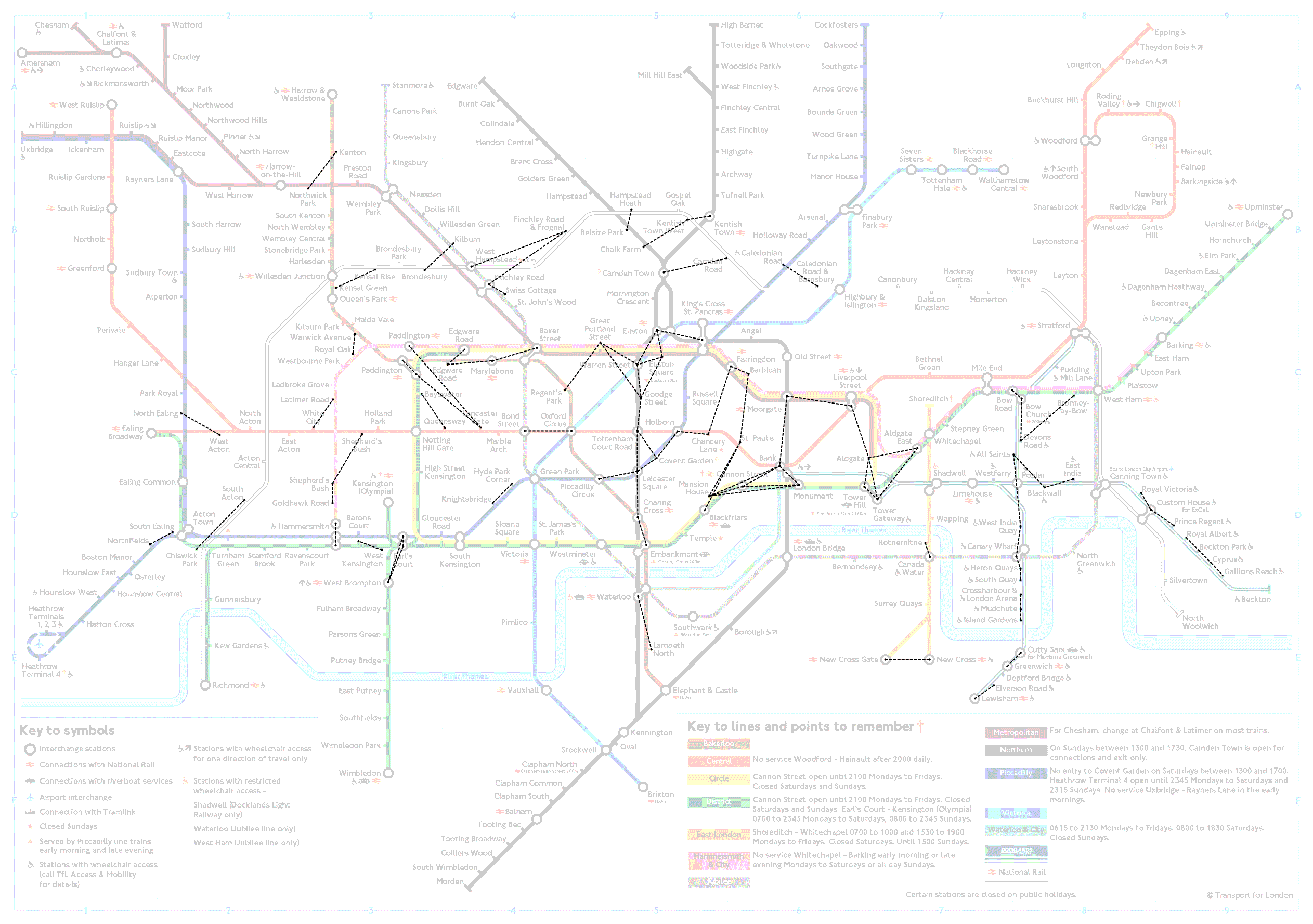
- And here’s the same with the tube map faded out slightly, so you see the walklines more easily.
- And here are the walklines without the original tube map behind it. They look like un-named constellations.
 Walklines altered the map...